Matheus Paschoalini Personal Brand
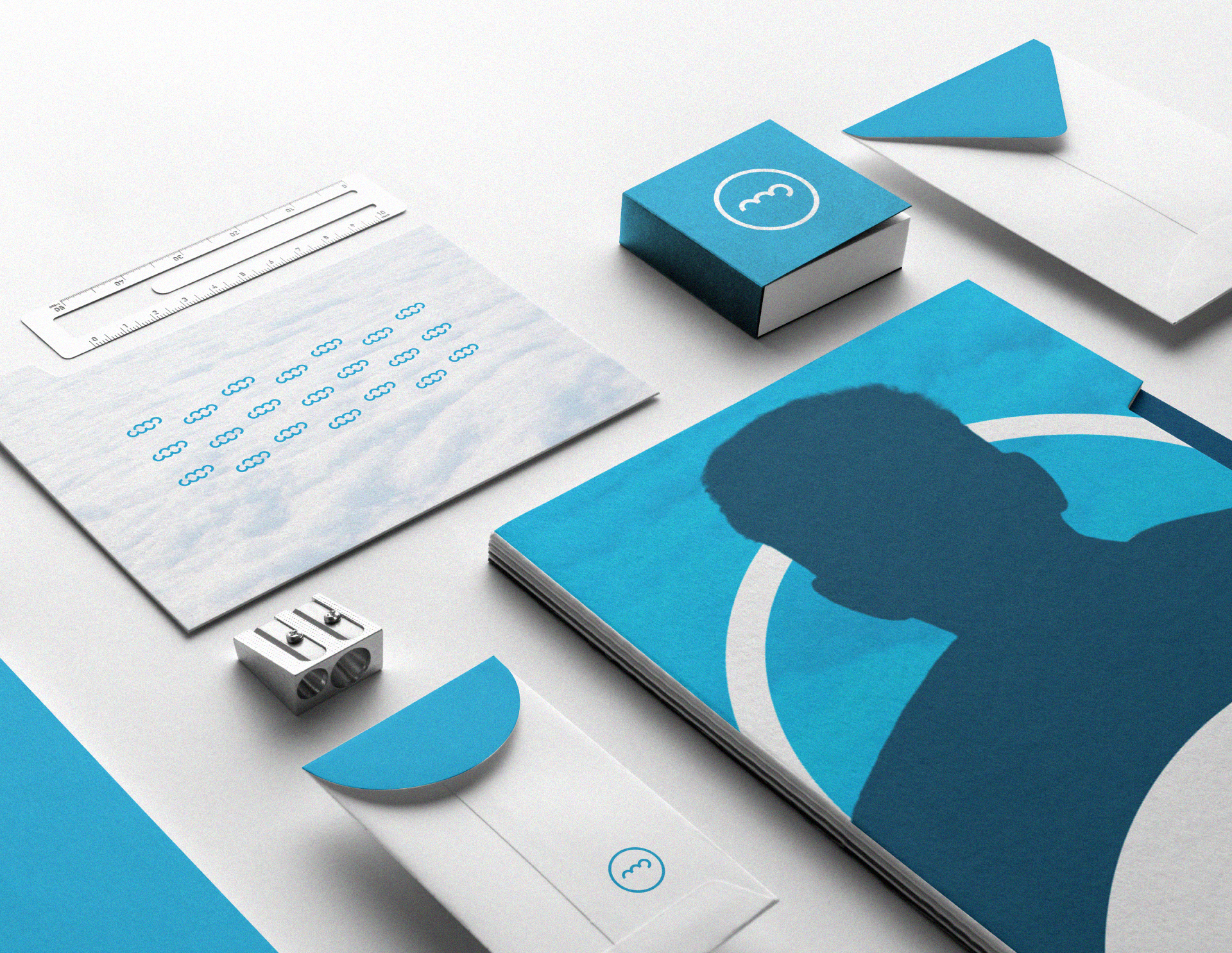
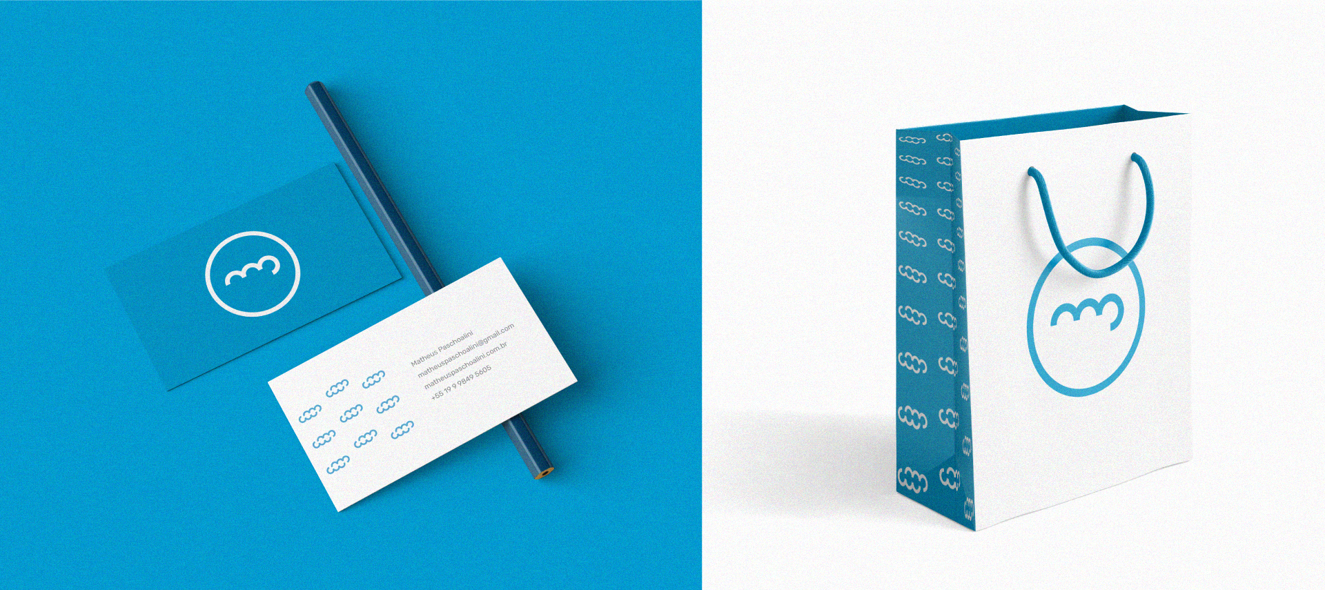
[PT]
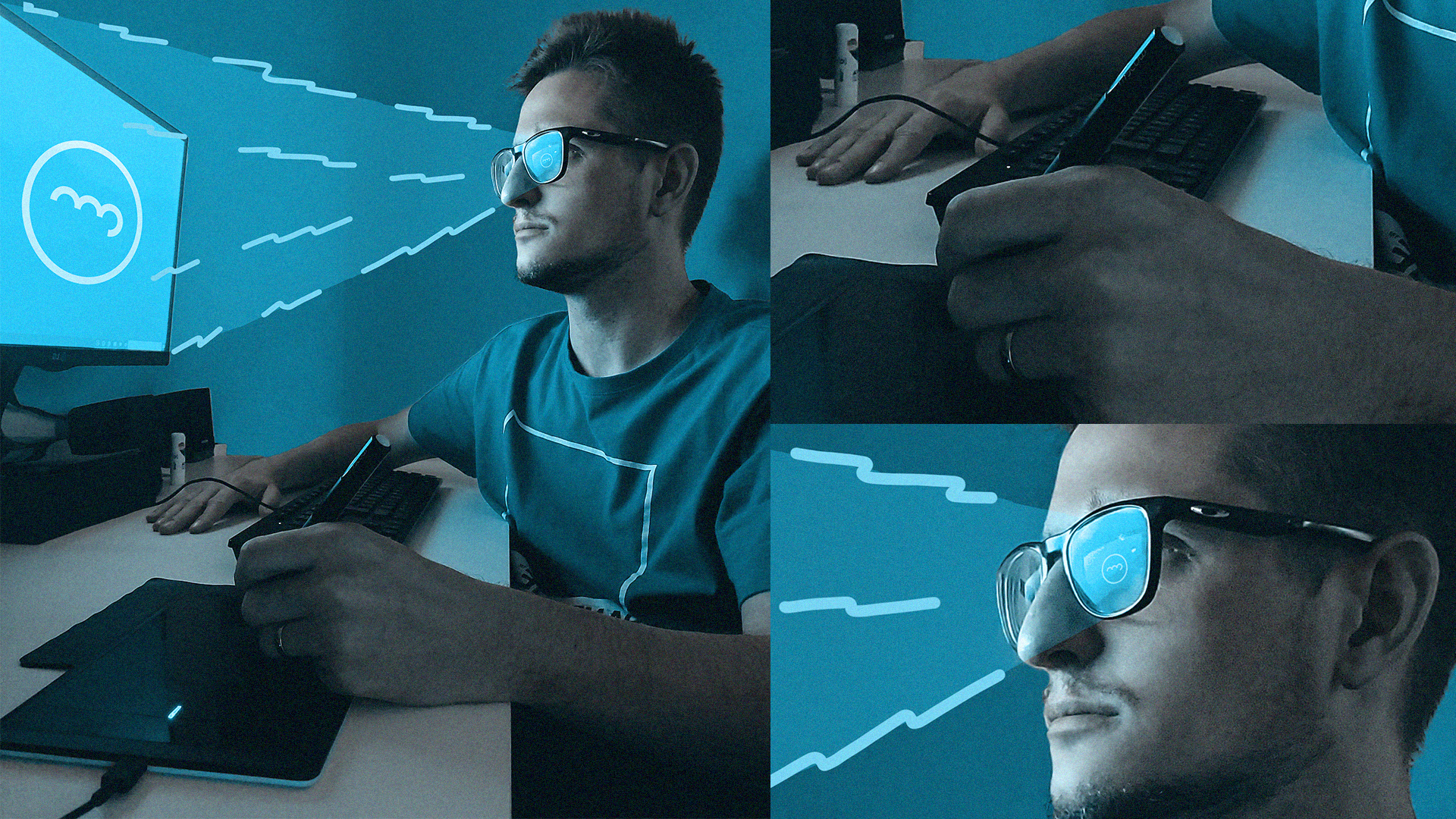
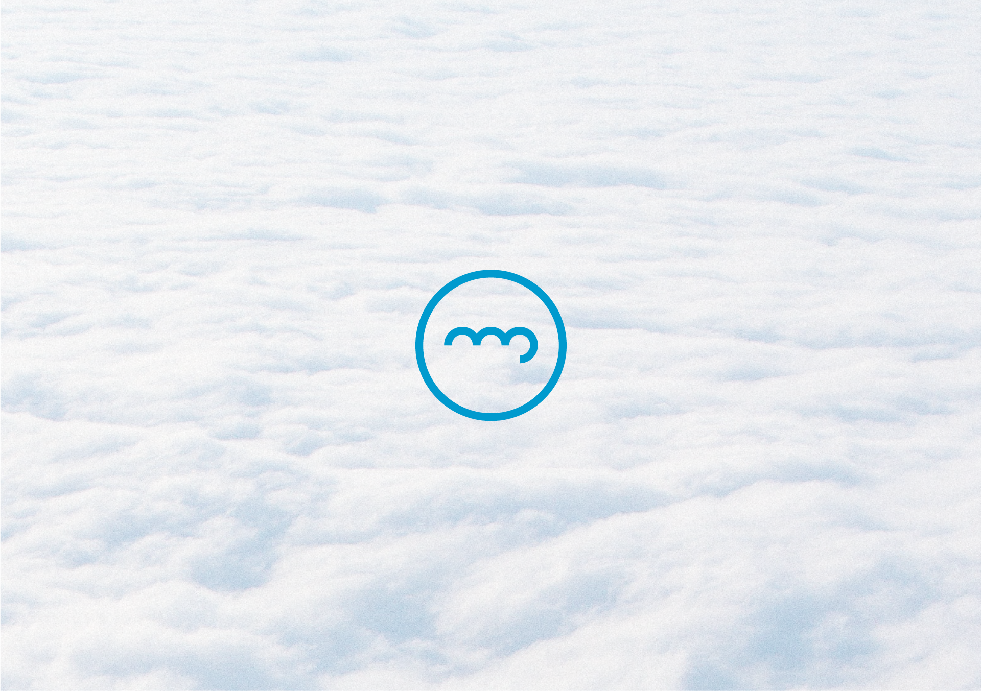
O símbolo foi construído pela junção das inicias M (de Matheus) e P (de Paschoalini) representando a forma de uma nuvem. Mas por quê uma nuvem? É que ela fica acima de tudo, contemplando uma visão única e abrangente da terra. E isso reflete na minha profissão como designer de marcas, pois cada trabalho é um universo que precisa ser visto de cima para haver um entendimento absoluto. Sem contar que as nuvens brancas sugerem felicidade e harmonia, qualidades que considero primordiais estarem presentes no meu dia-a-dia como designer e humano.
[EN]
The symbol was constructed by joining the initials M (from Matheus) and P (from Paschoalini) representing the shape of a cloud. But why a cloud? It is that it stands above all, contemplating a unique and all-encompassing view of the land. And this reflects on my profession as a brand designer, as each work is a universe that needs to be seen from above in order to have an absolute understanding. Not to mention that the white clouds suggest happiness and harmony, qualities that I consider essential to be present in my daily life as a designer and as a human.


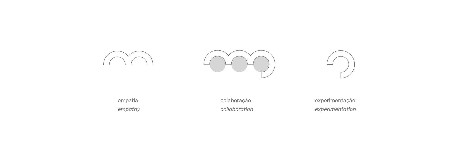
[PT]
Os três pilares iniciais do design thinking foram utilizados como guias para a construção do símbolo.
[EN]
The three initial pillars of design thinking were used as a guide for the construction of the symbol.